People outside of the tech or UI and UX design space don’t always understand how important both these two fields are to each other. If your product is great and design isn’t, it may not necessarily always be a success and vice versa. So what would be the right way to ensure that people visit your website or mobile app? The Answer – Good Design.
Are UI and UX Design the same?
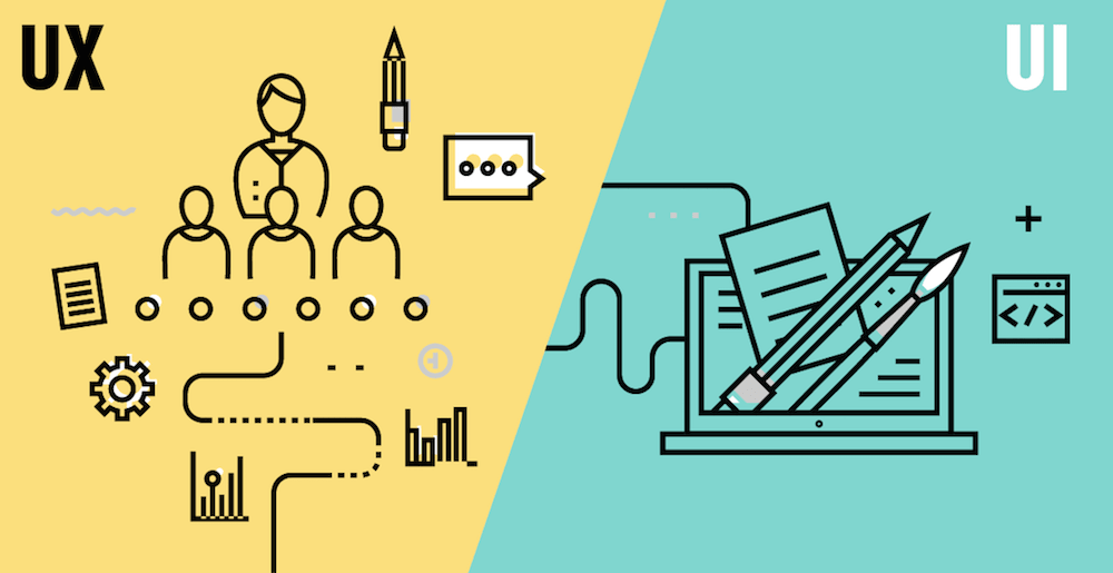
UI and UX Design or User Interface and User Experience are two completely different and autonomous aspects to design that are both equally important and contribute to each other in making the overall product a success. Let’s break it down for you if you haven’t ever fully been introduced to the two concepts.
UI or User Interface is primarily what the app looks like or rather simple graphic design. From color concepts to command copy, UI is basically the ‘look’ of the app.
UX or User Experience focuses more on the usability of the app. This is slightly more complicated than UI considering that there is an actual thinking process required to create a satisfactory user experience. Some designers create what is called a ‘Design Thinking Process’, which requires him or her to map out the whole journey of the app. For example, if you are on an Airbnb app, the app first asks for your location and for your travel dates. Once the selected options are chosen, the app allows you to browse through housing options. The options are showcased in a pictorial form, where the only written info under the options is the location of the house and prices. The next step is selecting the chosen housing facility. After this, the app takes you to the dedicated page for that housing facility complete with all details like the amenities offered, pax pricing (per person pricing), etc.
‘Which Location’ > ‘Travel Dates’ > Housing options > All Info > Book
The flow chart above is basically a rough mapped out journey the user takes while on the app. And a similar flow chart was probably created when mapping out the app. In cases of websites, this is also referred to as Web Mapping. Similar service providing apps will probably have a similar flow chart. In this particular case of Airbnb, the availability of the housing facility for particular dates is what determines the options shown to the user to browse through. This is done so because Airbnb promotes homes or townhouses rather than hotels or lodges. In those cases (for example, apps like OYO or Goibibo will fall under the latter category), since the establishment has accommodation for multiple guests simultaneously the ‘availability dates’ will probably not play as big a role or rather it won’t be one of the first few steps in the Usability flowchart. A simple misplaced step can change your business model. That is why it is always advised to consult a UX designer while devising an app product.
With this clear understanding of the two aspects of app building, we can now begin to study the effects of a good UX design on your business. In the above-mentioned case of Airbnb, we are dealing with a business model that aims to provide its users with options for homestays in different locations. The UX designer obviously had to conduct a research into the industry which he or she is going to cater to as well as the hospitality industry with a special focus on lodging. UX is a lot more than just plain old graphic design.
Case Studies: Hubspot & Snapchat
How One Solution May Not Always Work for All
Hubspot
Hubspot, the pioneer in online marketing software is a good case study for the same. Well-known UX designer Austin Knight along with a small (and supremely talented) team completed the project of entirely redesigning the website in almost a month and a half. Currently, Hubspot receives around 4 million users per month across 90+ countries.
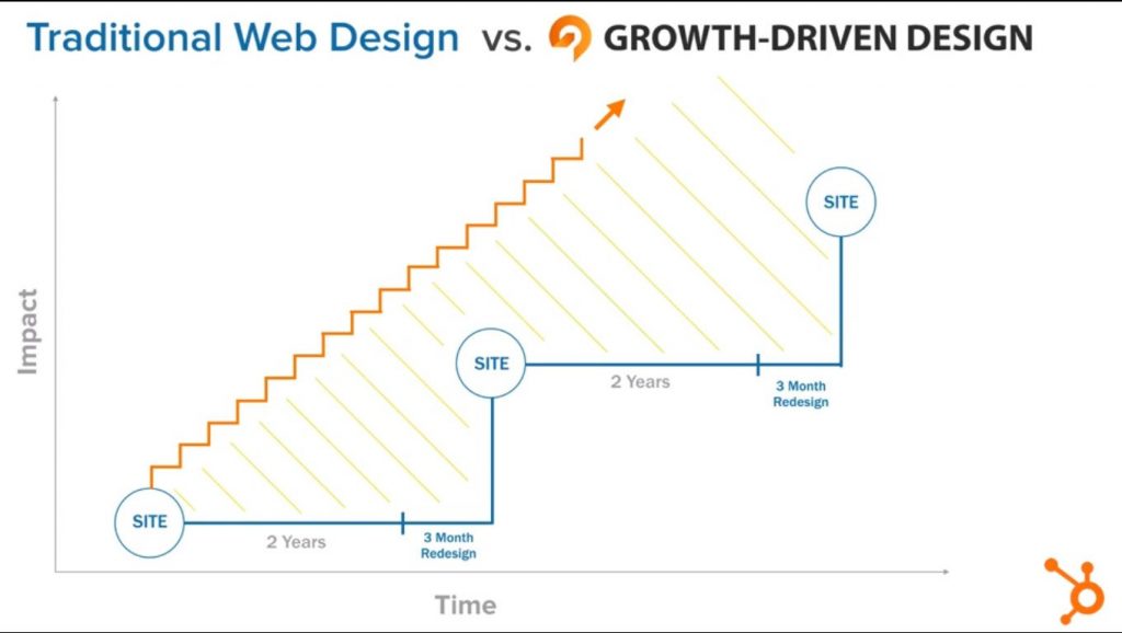
From being a mere private company, Hubspot went on to become one of the biggest online public organizations globally overnight. To cater to this sudden boost, the homepage needed to be redesigned keeping in mind that the entire business relied on the web presentation and functionality of the website. In this case, the UX redesign worked well in growing the company. However, not every redesign story has a good ending.
Snapchat
Very recently, Snapchat the app changed the look and feel of the app throwing its users in frenzy. The change opened up to getting fierce criticisms from all users, with some even begging the social media giant to revoke these changes and to get back to plain old Snapchat the way we have all come to know. I’m going to spare you the details, but users were basically finding it difficult to find the old options in the same places. Some were even upset enough to simply remove the app taking to twitter to express their displeasure with this new update.
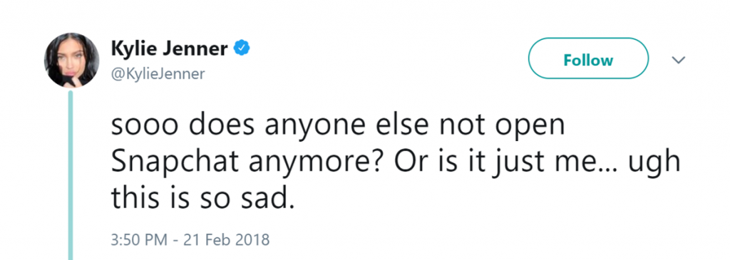
In response to this, Snapchat tried to revert back to almost every user stating that the new design has been incorporated for long-term benefits for them as an enterprise as well for its users.When interviewed recently regarding the new design changes, Spiegel explained that the new redesign was basically an effort to differentiate between personal content and consumer content, making plenty of room for ads space giving Snap an opportunity to monetise even further. This is a simple design change which makes sense, however a shift this big in the UX or User Experience has taken a toll on the app. As on 1st May ’18, Snapchat lost 17% of its stocks on Wall Street in the early hours. This is the lowest the social media giant has been ever. Spiegel also commented saying that the redesign is something they will not revoke and it’s simply a matter of getting used to the new redesign.
Only time can tell whether this is a good move or not. But this is a very clear case of UX restructuring which can break the app. In retrospect, Spiegel might actually be right in saying that this is what is best for them as well as its users. However, with a user base in millions, such big design changes (even though justified) might not go down well with the consumers.
Bottomline
From once being obsolete to now being the deal-breaker, UI and UX design is a key ingredient in a good online business model. I know we stressed a lot on the importance of UX rather than UI, but we cannot have a good UX model if our basic design (UI) is not satisfactory. As for the case of Snapchat, only time can tell if Spiegel’s long-term goals are met with this design change and if the risk is worth it. Let’s just hope their investors are as adventurous as Spiegel himself!


Shagun, thanks for the article post.Really thank you! Great.
Shagun, thanks a lot for the post.Really thank you! Much obliged.
Nice post! These useful tips should be requirements for designers. I’ll keep this in mind. I’ve found additional information related to this topic: https://mlsdev.com/blog/66-ui-ux-design-for-users-with-dyslexia
I really can’t believe how great this site is. Keep up the good work. I’m going to tell all my friends about this place.
Good one! Interesting information over this web. I spent some hours trying to find such informations. I’ll share it with a couple of friends interested in it. Thank you!!
Super! Interesting tips over here. I spent some hours searching for such informations. I will share it with some friends interested in it. Now with the work done I will browse some online model Cams Thank you very much!!
Indeed a great blog that describes the importance of design thinking in depth. Sharing it with others too.
Interesting and helpful read. Thanks.
Simple and easy!! Interesting tips over here. It’s pretty worth enough for me. In my opinion, if all website owners and bloggers made good content as you did, the internet will be much more useful than ever before.| I couldn’t refrain from commenting.
Great post, thanks for sharing!